Last year, when Apple introduced its new “Liquid Glass” design language, the reactions were not quite as warm as the company had hoped. While the new translucent interface covered all of Apple’s operating systems, Mac users, in particular, were the most angry and frustrated. Social media platforms and Reddit were flooded with complaints, with some users even vowing to stay on the Sequoia system and not upgrade to macOS 26 because this design made reading text and identifying icons a difficult task. Fortunately, it seems that Apple has finally listened to the voices of angry users and decided to offer smart fixes and unprecedented flexibility in its upcoming updates for the Phonegram iOS 27 and the macOS 27 Golden Gate system.

Smart Adjustments in iOS 27
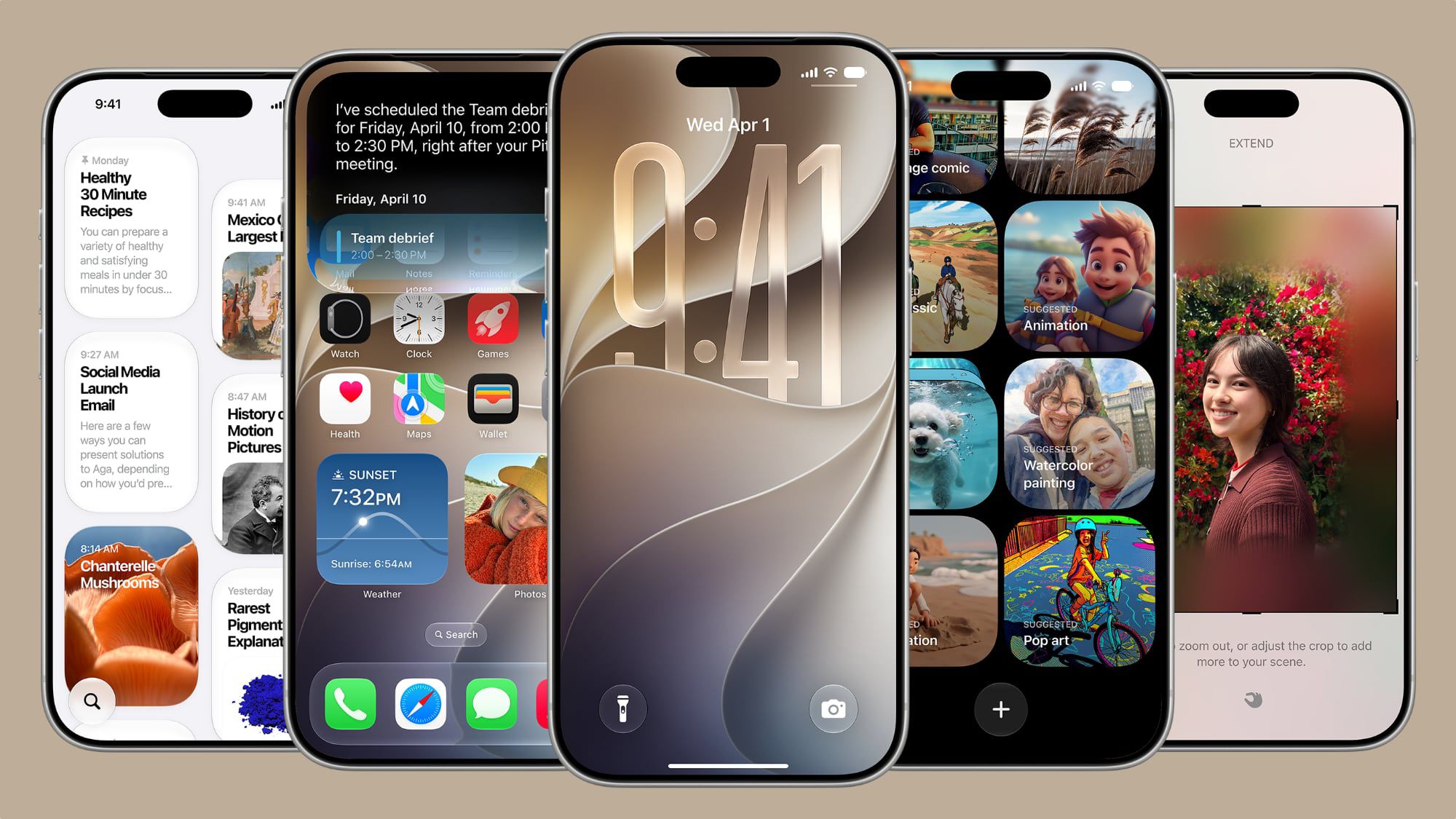
The iOS 27 operating system for the iPhone brings fundamental improvements to the “Liquid Glass” design language. The most prominent of these additions is a new slider dedicated to controlling the level of transparency, aiming to make content and control elements clearer and more readable. In addition, the Liquid Glass icons have become sharper and clearer, and menus, buttons, and other elements have gained extra visual depth thanks to new light refraction features, with the home screen now supporting ultra-large widgets.
All these changes represent a serious attempt by Apple to address previous complaints. The company has added dark edges around the Liquid Glass elements, along with bright light highlights to give the interface a superior visual depth that makes it easier to read and distinguish between elements.
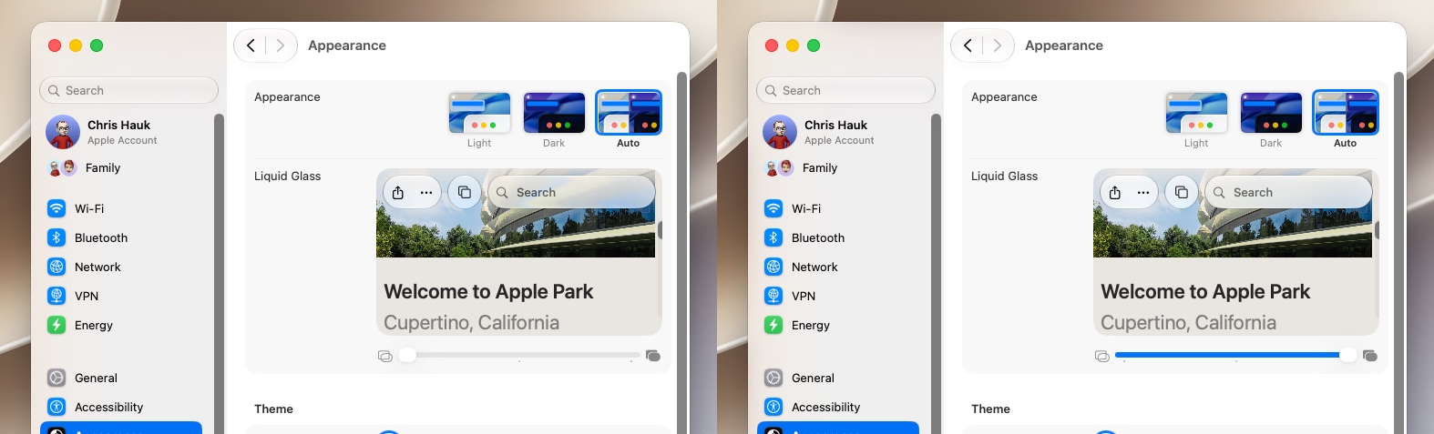
Perhaps the most important feature is the full control over transparency by going to Settings > Appearance > Liquid Glass, where you will find a slider that allows you to adjust the effect from fully transparent to completely opaque, which gives you absolute control over the look of the system as shown in this video:
As for developers, the good news is that their apps will automatically benefit from these improvements when running on the Phonegram iOS 27 system without the need to modify code. When content passes beneath floating bars in apps, a unified toolbar will keep text clear and readable by automatically enhancing contrast. Apple has also updated the Icon Composer tool to enable developers to build multi-layered Liquid Glass icons and add refraction effects and precise control over them.
macOS 27 Golden Gate Restores the Interface’s Prestige
Since Mac users were the most vocal in criticizing the Liquid Glass interface, the macOS 27 Golden Gate system has received a generous share of fixes and visual adjustments that restore balance and practicality to the system interface.
Just like the Phonegram iOS 27 system, the Mac has received a special slider to control Liquid Glass transparency across the entire system. This change is not limited to default apps only, but extends automatically to third-party apps without the need to recompile code, and the design intelligently adapts to accessibility settings such as reducing transparency and increasing contrast.
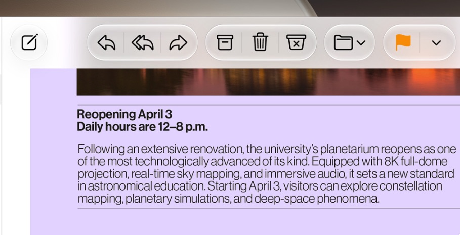
In addition to transparency, windows and toolbars have undergone major changes; toolbars have been unified to make titles and control groups clearer. Window corners have also been unified to be more consistent across different apps, noting that window corners in the Golden Gate system are sharper and more cohesive compared to the previous Tahoe system. Thanks to changes in shadows, opacity, and the new sidebar design, it is now very easy to distinguish active windows from others.
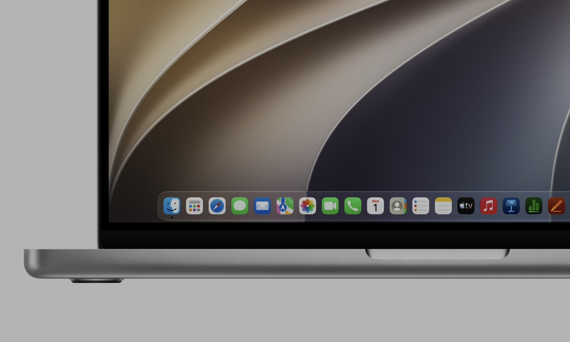
Apple did not stop there; it fixed the sidebar to extend from edge to edge, getting rid of the distracting floating design and its unnecessary shadows. Most importantly, the vibrant colors of the icons inside the sidebar have returned after being stripped away in the previous update! As for Mac icons, they have maintained their “Squircle” shape but with more detailed and sharper layers of Liquid Glass. HDR technology has also been employed to add realistic depth and stunning visual dimensions to the entire interface.
Availability and Access
The first beta versions of the Phonegram iOS 27 and macOS 27 Golden Gate systems are currently available for developers to test and experience. The public beta is scheduled to be released to users next July, with the final stable version available to everyone as usual in early autumn.
Source:
Leave a Reply